Good evaluation/commentary, i liked how you started off as a Group and broke it down into pairs and then individual commentary saying what you learnt from making the music video and your feedback.
liked the editing and transitions from the commentary to the clips, also how the digipack was shown alongside the clip of commentary about the advert.
Group 48 Feedback
Many good points, we liked it (Y)
Each question was explored with a lot of detail and we liked the outtake at the end.
There could be more insight into new media technologies. We felt the questions and points were shared through the group effectively and the commentary was a good length.
Each question was explored with a lot of detail and we liked the outtake at the end.
There could be more insight into new media technologies. We felt the questions and points were shared through the group effectively and the commentary was a good length.
Feedback on video commentary
Like the editing effect that you use when the digipack appears next to whoever is talking.
Like how you film the group talking as well as having them talk on their own which allows the speaker to air their own views..
Quality poor - not your fault.
Like how you film the group talking as well as having them talk on their own which allows the speaker to air their own views..
Quality poor - not your fault.
Feedback from 44
You could hear what you were saying, your information was in a media context which proved to show your expertise in the work.
Your video effects were good and showed a smooth transition.
The individual responses to sum up your times working on the task was a brilliant idea which we wish we used!
Nice work.
Your video effects were good and showed a smooth transition.
The individual responses to sum up your times working on the task was a brilliant idea which we wish we used!
Nice work.
Friday, 11 December 2009
1) What ways does your Media product use, develop or challenge forms and conventions of real media products?
Our media product tends to challenge the forms and conventions of real media products. However there is also evidence of it developing and using existing forms and conventions. We chose to create our music video in this particular way in order to make it unique yet still complying with some conventions of a hip hop genre. By challenging the typical conventions of a hip-hop genre music video we believe that the music video will be enjoyed by a much larger, varied audience from the different social groups.
To begin with our music video falls in to the hip hop genre. Typically in a music video from the hip hop genre there would be evidence of a luxury lifestyle showing wealth through material things such as, cars, big houses, clothing, and electrical items etc through the mise-en scene of the video. However our video challenges this convention as almost the opposite effect is created where being the main character has been displayed as almost ‘your average person’ living a much more common lifestyle within society. We produced our video using a very ‘average’ character so that there would be an increased audience size as more people can relate to this type of character.
Furthermore in existing videos within the hip-hop genre one of Goodwin’s points; the notion of looking is a commonly used convention. Our music video challenges this convention as there is no voyeurism and women aren’t being objectified (unlike other music videos in the hip hop genre for instance, ‘Candy Shop’ by 50 cent.) Throughout the majority of our video the main character, Rob is looking directly at the camera (towards the audience) and thus there is no evidence of voyeurism or objectification of the artist. Generally Hip Hop music videos are filmed in high budget locations such as a private beach, mansion or possibly even a nightclub. Once again our video challenges this convention as it is filmed in a low budget location, our sixth form college. (Originally we had intended on filming in Cambridge town however plans changed in order to reduce transport problems for the cast and other issues affecting the efficiency of filming.)
On the other hand we have conformed to one particular convention of music videos within the hip hop genre. This being where the artist is the main focus of the video. We have used this convention in order to sell the artist and ensure the audience can recognise them. This convention is another of Goodwin’s points, to meet the demands of the record label and to sell the artist. Throughout our video ‘Rob’ – the main character is seen in almost every shot emphasising the ‘selling point’ of the music video and we have used many close-ups to ensure this. Moreover we have also included varied shots such as, medium and long shots, to differentiate our music video
Another of Goodwin’s points analysing the relationship between lyrics and visuals was challenged as we didn’t focus on creating a connection between the visuals and lyrics but more so on the music and visuals (once again another of Goodwin’s points). Our song is very upbeat and has quite a fast pace to it. We represented this in our video by the use of colour. We incorporated vibrant colours through the costumes and props included within our video. To emphasise the use of colour we edited the increased the brightness of the footage during the editing stages of production. Furthermore we ensure the main character’s walk was in time to the beat of the music this strengthened the relationship between the music and visuals once again.
When creating our digipack for our music video we incorporated aspects seen in other digipacks from artists within the hip hop genre as well as including our own, unique ideas to be in keeping with our music video that tended to challenge the conventions of the hip hop genre. In order to get an idea of how a digipack ‘should look’ we researched existing artist’s digipacks from the hip hop genre. We looked at 50cent, Nelly, Eminem and other similar artists. We found that their digipack’s had an intense focus on the artist. We decided to use this convention in our digipack in order to sell our artist and ensure they can be easily recognised, therefore we decided to use an image of our main character, Rob, we took various pictures of Rob in different stances in order to find an image that would be suitable. We used one of the images taken of Rob in the magazine advert to allow the relationship between them to remain strong, another convention typically used for the artist within the hip hop genre within their digipacks and advertising.
2) How effective is the combination of your main product and Ancillary task?
The music video and ancillary task (the digipack and magazine advert) secure a very strong relationship. Continuity is seen throughout the three products. This has been created by using various techniques and also conventions of typical hip-hop music genre. To begin with we included a still image of our main character on both the digipack and poster. Although the character maintains a different pose in each picture the images still show continuity as the style is kept the same. We chose to keep the character dressed in the same costume as in the music video to heighten the effectiveness of the continuity. We hoped that this technique would also allow the audience to recognise the artist (a convention that artists within the hip hop genre tend to use.) The images for both the digipack and poster were selected as they were the ones that we felt would ‘sell’ the artist to the best ability and create a comical effect that would tie in with our comical music video. The images were colourful, vibrant and eye-catching tying in with the theme of our music video, in which we intensified the brightness of the footage. The products within the ancillary task both used very similar fonts and the main colour scheme was purple. We used the colour purple to create continuity as the main character is wearing purple in our music video.
In our research we found that artists from the hip hop genre tended to include quotes concerning the excellence of their music videos. On both the digipack and advert we included quotes from NME magazine, the Sun and Mojo. We used these businesses as they are well known magazine/newspapers that have some link to the music industry, particularly Mojo and NME. By including these quotes we are also assisting in promoting the artist, as often customers will rely on these quotes.
On the other hand our DVD cover differentiates from the advert as it uses a brick wall as its background as apposed to a plain white background. We have included this background to fit in with our music video theme ‘the school boy geek.’ Whereas we included a plain background for the poster in order to depict the different product and allow repetition to be avoided. This white background also allows the main image to become more striking and eye-catching for the audience.
Looking at the feedback we received on the DVD cover it has been made apparent that it wasn’t necessarily as clear as it could have been. I feel that this was due to a lack of time that we had to spend on it. The intentions we had when creating the DVD were much higher than the amount of time we had. However I feel that the crucial elements of a DVD cover were included such as, the quotes, image of the artist, artists name, record label, barcode, general DVD information i.e., special features, ‘DVD’ and ‘HMV’ logo.
3) What have you learnt from the audience feedback?
During this project we have used blogger to post our thoughts, research, ideas, pitch, rough cut, final idea, ancillary task etc. We have received feedback that has been of great help in creating our overall products. The feedback expressed the audience’s thoughts and opinions on our work. We did receive some criticism but we used it as constructive criticism in order to better our products. This feedback allowed us to see areas that could be improved upon that we wouldn’t have necessarily noticed when working on the project all of the time. The ideas that were suggested helped us to improve and get the best possible product.
The first thing we found from our audience feedback on our pitch was that our original idea for our music video was possibly too ambitious. We initially planned to film in the centre of Cambridge but when we presented this idea to our classmates they gave us some realistic feedback suggesting how it may be difficult to find the time to carry out filming and also suggesting issues with transport (getting our desired, large cast to the centre of Cambridge) This feedback led us to rethink our original location and we decided upon filming in our sixth form where being it would be much easier and less problematic. This location did prove to be much more convenient for our cast and also meant that if, and when we may have needed to film extra footage it would have been done far more efficiently.
When we uploaded our rough cut to the blog we received mixed feedback, including positive and negative comments. The main negative feedback we received was concerning the gender of the artist who sings Stop Complaining and our main character. They stated that it was clear that the singer was female whereas our main character was clearly male. Although at first we debated whether to change this we decided upon keeping it the same. The reasons being that Rob’s character was a geeky, unpopular school boy who proved to be quite ‘random’ therefore the female voice just contributed to this slightly arbitrary effect that had been created.
The feedback enlightened us with another area that could be improved upon, we had minimal shot variation. Mostly being medium shots. The feedback suggested we included more shot variation. Therefore we included more close up’s and long shots; along with bettering our music video as a whole this technique would also help us to sell the artist.
On the other hand we were congratulated on the effectiveness of our lip-syncing and much of the feedback expressed the strength of our editing. Along with receiving feedback on our rough cut we also received feedback on our final cut which tended to be very positive.
Furthermore the feedback we received on our ancillary task was positive however there were some areas of our DVD cover that appeared to need improving. Unfortunately we were unable to apply these improvements as when we received the feedback the deadline for completion had already been passed. The reverse of the DVD cover was seen to be confusing, as the order of the quotes and special features were a little mixed up. Another piece of feedback we received was on the differentiation between the logo’s on the magazine advert and digipack. Finally we were also informed that a certificate rating was not included on the DVD cover, we were aware that we hadn’t included this however, it was a shady area as although our target audience was 15-18year olds we had to give our music video a certificate rating of 18 as the lyrics of the song included swearing. I believe that had we been allowed more time to complete the digipack these minor faults could have been improved or likewise if the feedback from the audience had been given before the deadline, proving the effectiveness of the feedback.
4) How did you use new media technologies in the construction, research, planning and evaluation stages?
Throughout this project a large variety of media technologies were used. To begin with one of the main technologies we relied on throughout our project was blogger. This website allowed us to display our working progress, through all of the stages of production. We were able to express our idea during the planning stages, research of other artists, digipack’s, music video’s etc in the research stages, our rough cut, final idea and ancillary task and many more of the vital stages of production could be entered on to our blog. The blog supported us with providing the opportunity for feedback from our audience and also the opportunity for others to look at our work. It also allowed us to evaluate our work in the evaluation stages of production.
Not only did we use the internet to aid our project we used professional programmes particularly in the editing/construction stages of the product. These programmes were final cut and Photoshop. When we carried out the preliminary task at the end of last year we created a short one minute video. When editing this footage I felt unsure of how the procedure worked and we stuck to very simple editing and cut techniques with no added effects. After completing this project I have successfully learnt to understand and use Apple’s final cut editing programme including special effects such as spin off’s and motion key frames. In our music video we have intensified the brightness of our footage; this is another new skill I discovered. We used different filters to enhance and edit the appearance of our footage in order to intensify the brightness we put on a colour corrector filter and changed the saturation and contrast of the footage. Final cut has played a major part in constructing and editing our product as we used it to edit all of our footage. I now feel comfortable in using Final Cut to edit footage and even to add special effects in order to improve the final piece.
Furthermore when producing the ancillary task, I have expanded my understanding of the programme Photoshop and developed my skills. Photoshop allows the user to edit and personalise graphics to their desires. I have used Photoshop in previous projects giving me a basic knowledge of how to work it but, not to the extent I did in this particular one therefore I have once again developed my skills. We used Photoshop when creating the digipack and poster. The programme allowed us to edit the main picture of Rob, using the ‘magic wand’ tool to erase the background of the picture and enable it to be placed on top of another layer or moved about. However we did face one problem to do with the amount of layers involved, if layers were left un-named or too many were created it could get very confusing and likewise time consuming to carry out a simple task.
During the construction stages, we used a dolly to assist with filming. This was a new piece of equipment that enabled us to achieve sturdy filming. I had never used a dolly before but, managed to successfully use it with ease. The dolly produced a much more professional result as hand held filming proved to be too shaky.
Overall I feel that our project went very smoothly. In some areas we could have used a little more time to complete tasks. However given the time, equipment, funds and knowledge we had we have produced a very good product. I feel looking back to the preliminary task last year I have thoroughly developed many skills particularly in the editing stages of production and therefore been able to apply them when creating our music video. I feel I am much more confident using the new media technologies and have learnt a lot from this project.
:)
Thursday, 10 December 2009
Script
(INTRODUCTION)
ROB:
JODIE:
ROB:
ROSE:
BRYONY: Although we challeneged most conventions we followed them aswell because we sold the artist through the whole video as the camera focuses on him through the whole video and all of the shots.
(DIGIPACK - ROB&BRYONY)
ROB:
BRYONY: We tried to match our magazine advert to the DVD cover as much as we could so that the advertising is more effective and it works better as a marketing tool. Obviously it's quite hard to make it exactly the same becaus the DVD cover is in a slightly different style but I think all three things work really well together.
ROB:
(DIGIPACK - JODIE&ROSE)
ROSE:
JODIE:
ROSE:
JODIE:
ROSE:
JODIE:
ROSE:
JODIE:
(AUDIENCE FEEDBACK & PERSONAL COMMENTS)
JODIE:
ROSE:
BRYONY: One of the things I've learnt from doing this project is that I've learnt a lot about Goodwins Point Analysis and I've also how to do a lot a lot on photoshop and I've developed my skills on final cut a lot more.
ROB:
ROB:
JODIE:
ROB:
ROSE:
BRYONY: Although we challeneged most conventions we followed them aswell because we sold the artist through the whole video as the camera focuses on him through the whole video and all of the shots.
(DIGIPACK - ROB&BRYONY)
ROB:
BRYONY: We tried to match our magazine advert to the DVD cover as much as we could so that the advertising is more effective and it works better as a marketing tool. Obviously it's quite hard to make it exactly the same becaus the DVD cover is in a slightly different style but I think all three things work really well together.
ROB:
(DIGIPACK - JODIE&ROSE)
ROSE:
JODIE:
ROSE:
JODIE:
ROSE:
JODIE:
ROSE:
JODIE:
(AUDIENCE FEEDBACK & PERSONAL COMMENTS)
JODIE:
ROSE:
BRYONY: One of the things I've learnt from doing this project is that I've learnt a lot about Goodwins Point Analysis and I've also how to do a lot a lot on photoshop and I've developed my skills on final cut a lot more.
ROB:
Bryony's Evaluation
In what ways does your media product use, develop or challenge forms and conventions of real media products?
A genre convention of hip hop music video would show evidence of a glamorous and luxury lifestyle through mise-en-scene. You would see expensive items such as designer clothing, jewellery, expensive cars and large houses. However our media product challenges this convention by showing almost the opposite lifestyle. In our music video, the artist is portrayed as being an unpopular, middle class character that shows no evidence of being wealthy or living in luxury. Our video was also filmed in a low budget location whereas a stereotypical hip hop music video would be filmed in a high profile location such as a club or a luxury house. Another major convention and one of Goodwin’s Points that we challenged was the notion of looking. In most hip hop videos there is often voyeurism where women in particular are objectified. There is no voyeurism in our music video as the artist is looking directly at the camera and addressing the audience throughout and although in some parts the artist is turned away from the camera briefly, he is not being objectified in any way. We have challenged a lot of conventions for this genre; we have also used and developed one. It is conventional in hip hop music videos that the artist is the main focus of the video and is being sold to the audience throughout. It is also one of Goodwin’s Points of Analysis that the music video should meet the demands of the record label, to sell the artist. I believe that our music video strongly conforms to this convention as we see the artist in almost every shot. In our video we included close ups of the artist helping the audience and potential consumers recognise him, but we also included medium and long shots to sell the artist’s style. Although our media product challenges a lot of conventions, I feel it is done in an effective way. We deliberately conformed to stereotypical genre conventions to make our video unique and to put across a different style of hip hop artist. Instead of trying to match the visuals with the lyrics in the song as most hip hop videos do, we focused much more on building a strong relationship between the visuals and the music. We did this by incorporating lots of colours into our video through costume and props and by emphasising the beat of the song with the artist walking along to it. This works well as the visuals are not completely random, as they link in with the music. Our digipack for our music video both conforms and challenges genre characteristics. When we researched digipacks from other hip hop artists such as 50 Cent and Nelly, we found that the main focus of the product was the artist. We wanted to stick to this convention as we thought it would be effective to carry on selling the artist using the digipack as well as throughout our music video. So we spent a lesson taking images and choosing the most effective ones to then put on our digipack. Both the magazine advert and the DVD cover are focused on our artist, therefore conforming to the genre conventions. Another thing we picked up on whilst looking at different digipack examples was that they were not very colourful and instead concentrated on showing the consumer the artist and their ‘bling’. We challenged this convention as we wanted to include a lot of colours on our digipack to conform with the music video and also to reflect the artist’s style. The main theme for our digipack was purple as this was the most dominant colour from the artist’s costume. I think the balance of using genre conventions and our own ideas for the digipack worked well.
How effective is the combination of your main product and ancillary texts?
I think that the combination of our music video, magazine advertisement and DVD cover are very strong together. I think that there is a strong sense of continuity between all three products. This was our aim from the start and I think we carried it out well. We took a photograph on a stills camera of the artist who was dressed in the same costume as he was in the music video. We decided to do this to create continuity but to also make the artist recognisable to the audience so that they could make a link between the music video and the magazine advert. We took a lot of images on the stills camera from all different angles, trying to get a good shot that would sell the artist well. I think we picked the most effective ones as they are a little bit edgy which reflects the artist and his character and the style of music video. The images create an edgy and slightly comical persona for the artist which also ties in with the music video. I think the magazine advert acts as a good promotional tool for the DVD. Although it is quite simple, the image is very eye catching and the text is strong and also quite edgy making the advert memorable. We included quotes on the advert from NME Magazine and The Sun, which are two well known papers/magazines. I think that this helps sell the DVD to the consumers as it has been rated by well known companies. The quote also supports the needs of producers as it reflects well on the product. The DVD promotes the artist well as he is the main focus of the DVD as his picture appears across the front and back. From reading our feedback I think that we could have made the back of the DVD a little clearer if we had more time but I think we have included all of the necessary information on it and I am pleased with the result. The DVD cover has continuity with the magazine advert as it uses a similar image and the same font. It also has continuity with the video as the image is of the artist with a big grin, which we see a lot of in the music video. Although the products have continuity between them, we also wanted to make each one a little bit different. For example we left the background on the magazine advert white to make the image of the artist look more striking and eye catching for the reader. However we then changed the background of the DVD to a brick wall to give the product a bit of differentiation to the advertisement but to also keep it looking different and edgy. I believe that the magazine advert and DVD cover would successfully attract our target audience of teenagers aged 15-18. The magazine advert would catch their attention as it uses graffiti style writing and the colours and unusual picture style would draw them in. I think the DVD would also attract them as it uses a similar image which shows off the artist’s style which I believe would appeal to someone that age.
What have you learnt from your audience feedback?
One of the things I think we learnt from our audience feedback was that our original idea for the music video was a bit too ambitious. We had planned to film the video in the centre of Cambridge with a big cast, as the artist walked around Cambridge members of the cast would join in dancing/singing. When we pitched the idea to our classmates we had a lot of questions which made us think about how realistic our idea was. People asked, when would we find a time to film when everyone was free? How would we manage to get everyone to remember the words? Had we planned which parts of the song we were going to sing? Did we have enough time to get everyone organised and film all our footage? These questions helped us to decide to film our footage in college which was a more convenient location for everyone. We were then worried that it would look like we made no effort as we filmed in college. However when we put our rough cut together, people commented on how the location suited the video. We got positive and negative feedback when we put our roughcut on the blog. One of the negatives that we picked up on was that a lot of groups in the class had commented on the fact that the artist was singing along to the female vocal in the song. We thought about perhaps changing this however we liked this effect because although Rob is portrayed as being the artist, he is also shown to be an unpopular geek at college who is walking around singing along to a song, and acting goofy. The fact that he sings along to a female vocal adds to the effect that he has a goofy character and is not a very ‘cool’ student. We also learnt that we needed to include more shot variety as most of the footage we had was all medium shots of the artist. Shots such as close ups and long shots would help us sell the artist and make the video more interesting to watch. One of the positive comments we received was that all our lip syncing was really good and was edited really well. This gave us the incentive to make sure that all of our lip syncing was edited as well as this in our final video. After reading all of our feedback we went out and filmed more footage for our video. We had all our comments from classmates which helped us keep focus and film effective footage. Not only did we get feedback on our roughcut but also on our final video. The most important thing we learnt from this feedback was that we had managed to make our video appeal to our target audience. Our target audience was for older teenagers aged 15-18. We know that our video appeals to this audience as our classmates are in this age range and we got very positive feedback and everyone seemed to enjoy it. Although our target audience is 15-18, we would have to rate the video 18 because of the language used. This is one thing we failed to include on our DVD cover which was also mentioned in our feedback. We also received some positive and negative feedback for our digipack. One of the things we learnt from negative feedback we received was that the back cover of our DVD was a little confusing as the order of the quotes and the special features is a little bit muddled up. We realise that this could have been made better if we had more time to do it. A classmate also picked up on the fact that the logo for the artist (Lyrics Born) is different on the DVD cover than the magazine. We knew that this may look a little strange however we struggled to make the logo from the magazine advert look good against the brick wall so we decided to use a different logo that would stand out more. However a positive we received was that both pieces of work look professional and the use of the artist on both the DVD cover and the magazine advert is effective.
How did you use new media technologies in the construction and research, planning and evaluation stages?
During the construction stage our group used the dolly to aid us with our filming. Although I have never used the dolly before I thought it was a really useful piece of equipment and was actually very easy to use. I think helped us a lot in our music video as a lot of it involves tracking shots following the artist around the corridors. The dolly helped us to keep these shots smooth whereas it would be very bumpy if we did them handheld. I think that I have also developed my skills on final cut during the editing process. Each member of our group got to have a go at editing. When it came to my turn, to start with I was nervous about ruining the work that my other group members had done but looking back on it I am surprised how much I have learnt since the preliminary task at the start of the year. Our preliminary task was to make a very short music video for a minute of a song. The video I produced in my other group consisted of very basic editing using just simple cuts and no effects. However from doing this project I have learnt to use final cut so much more effectively. In our video we have included different transitions such as spin outs. This is where we span a frame out to the corner to reveal the next shot, using motion key frames. This is a completely new technique and I think it looks really effective. I have also learnt more about using different filters to change and enhance the appearance of our footage. Our song is quite upbeat and we wanted this to be reflected by the colours in our video, however our footage actually looked quite dull when it was all put together. To change this we put on a colour corrector filter, which I have never worked with before, and used it to change the saturation of the colours and the contrast of our footage. After playing around with this we got the desired effect and also learnt to use the effect for future reference. I feel that I have also developed my skills on photoshop from doing this project. I use photoshop quite regularly in my photography course however I learnt new techniques from other members of my group. I have learnt how to apply a painted effect onto parts of an image rather than the whole of it using brushes and blending tools. We used this effect on the image for our magazine advert, it looks effective as it makes the image more eye catching and interesting. Not only have did we use professional programmes to help us create our music video, but we also used the internet to do a lot of research which was really useful in helping us work out our ideas and the style we wished to use for our digipack. We found that it was helpful to record all our research and findings from the internet and ideas on our blogs so that we could constantly refer to them and make sure we were on track.
Overall I feel that our group has worked well together and used our time and programmes effectively and efficiently to create a professional DVD cover, Magazine Advert and Music Video.
Rob's Evaluation
In what ways does your media product use, develop or challenge forms and conventions of real media products?
As are music video was of a hip-hip genre normally there would be typical characteristics that conform to this type of genre. But we chose not to conform to these characteristic. It challenges the way a stereotypical hip hop video looks by the way we have chosen not to objectify women or have expensive mis-en-scene, both these aspect being of the stereotypical hip hop genre. For example in the music video ‘Candy Shop’ by 50 Cent, this has a lot of objectified women. Looking at good wins points there is a large contrast between the music and the visuals, this being that the song is rapping about something complete opposite to where we have filmed, this being a school. The locations as well is not very conventional as most rap videos are situated on the streets or in some pimped out club or mansion. The idea of the school was just to empathises it being a normal situation for the nerd character(artist).
We thought it would be a good idea to differ the iconography that typical hip hop music videos uses for example the hoods and chavish clothing. We wanted to represent the artist as a normal everyday character. This was so the audience could relate to the character in the video as it is similar to most teenaged audiences. The artist is represented as a nerd not very social or attractive, we wanted this as we didn’t want to conform to the hip hop genre, though I feel doing this attracts the audience in a way that is more funny. The idea of the nerd was to make the audience laugh, this again is why it relates more to a teenaged audience because they would find this odd immature character funny.Also through the video it doesn’t always have the artist rapping to the audience thought we did put a small amount of this in. In some parts we chose to conform to the genre by the way we had the artist always on screen, this being the nerd. We did this as we thought it be best to give some sort of idea to the audience that it was a hip hop style song but with a cheeky fun twist. Not serious gangsters rapping to an audience giving impressions of toughness and glamour. Our music challenges these conventions with a more comic video. Typical hip hop video have a variety of shots that stick to the beat of the music as well as lots of main close ups of the artist , our video conforms to this characteristic as well as we kept a lot of the editing linked to the beat of the music as well as the visuals in the video also kept with the beat of the music, this conforms to the stereotypical characteristics. There are many close ups of the nerd character in the video this conforms to the genre and the audience are able to identify this character to be the artist as he is the main character on screen.
The choice in making are character funny gave the video a sort of comedy element we wanted to keep this thorough the whole video, this differs from typical rap videos for example, “ok, you’re right” by 50 cent. This video starts with a cops and robbers shoot out. Very different to how we started are video with a comic start.
Are video meets the demands of the audience by the way we have tried to make the audience laugh as the video start the audience can guess its going to be funny by the way the nerd starts dancing to the quirky start of the song.
How effective is the combination of your main product and ancillary texts?
There are a variety of links between our digi pack ad music video for example we have keep the same clothing from the main artist character ( the nerd) in the video and used images of this same character in the dig pack, this keeps continuity through are products, this I feel is very effective. Another thing we did to are dig pack was to have a ongoing theme of colour, this colour was purple as it was the main colour on the artists top, example of this theme being that the images and colour of fonts were all purple this again was to keep some sort of link between each piece, I thought this was effective as the combination between all of them worked well and have made each product stand out more , empathising them. This empathise on each product in the dig pack promotes the artist well which would enables album/ gig sales. Similar image were used one both the DVD cover and magazine advert this empathised the artists on the front, selling the artist to the viewer, this was the effect we wanted. To keep with the comic side of our video we also choose to have funny pictures of the main artist on the dig pack this was to empathises the products as funny. This challenge normal conventions as we wanted it to be funny not serious. The magazine advert promotes the DVD cover by the way the audience can relate to the cover as they would recognise the artist( nerd image on front), this enables the promotion of the artist and as well this would then attract new audiences. It would appeal directly to the audience by the way it shows similar images from the video plus as well we have tried to make the product and a comical element to them by the way we have chosen the images of the artist to have very comic expressions.
What have you learnt from your audience feedback?
Looking back I have learnt alot about how our audience thought about are video. With there ideas and comments made we have been able to edit are music video to improve it in ways our audience felt it needed be. Also feedback from audience showed us what aspects of the video worked well and whether we had continuity in our dig pack. Other feedback criticised our work which I feel was also need as then from the criticism our group was able to improve of things that weren’t so good. For example are video had gaps and our audience wanted more footage so we went out and filmed more. Audience liked are pitch however they thought it would be hard to film in Cambridge, this we to into account and changed our idea so it was more easier so we chose to film in college. Our rough-cut people said it was funny though we had major gaps this was letting us down to we had to film extra bits. Once we had done that and finish most of our feedback was good, our audience said it was funny. If there was anything that I could change about our video it would probably be the way we chose to edit the video, if we had longer I would of tried to put some kind of effects on it to inhanse aspects of the video just to make it more stronger and comical.
How did you use new media technologies in the construction and research, planning and evaluation stages?
Thorough the project a variety of media technologies were used. In the construction and planning stage, we used internet blogs to record are daily work so that people could see it and give used feedback this being useful in the evaluation stage. Editing software was used in the construction stage this was useful as I learnt how to create and used different tools on Final Cut to adapt and change the effect of our groups camera footage. I learnt to uses different transitions and ways to make clips of our video move whilst playing. Another part of Final Cut I used was how to change the filter of a part of footage so that it emphasised colour to make are video brighter. Final Cut software was a major part in the construction and editing stage. When make the dig pack I used Photoshop to create a magazine / DVD advert , here I made images by creating layers and using different filters and tools on Photoshop. For example the image of the nerd on the magazine advert its half cartoon half normal this was done using two layers and a filter on Photoshop. This I found to be most useful as it enable our group to create a attractive dig pack that would catch the eye of a viewer which is what we need for our dig pack.
Since the projects we did in AS and the preliminary task I feel I have improved my editing techniques as I have learnt a variety of way to inhase colour etc. these tasks help me get use of the software so that when it came around to my final project I found it easier to use the software and create a music video.
Sunday, 6 December 2009
Written Evaluation
In what ways does your media product use, develop or challenge forms and conventions of real media products?
Our music video fell into the Rap/Hip hop genre. This is because our song is used to discuss personal, social and also political issues. Goodwins points back up the genre. The use of explicit swearing in our song lyrics also makes it this genre because other than rock music, not many genres of songs such as classical or indie use this way of representing music. An element of mise-en-scene is the location. Our original location was going to be in Cambridge, but we didn't really think about the time we had and also the hassle of getting everyone there at the same time. Instead, we chose the College. Filming in College or a school isn't really a convention of a hip hop video. It would usually be filmed in the streets with posh clubs or a bar or a massive house. Choosing the college could make it appeal to an even younger audience who are at school. The person in the video is at the college and other people could relate to it as it is in a familiar environment. When researching other artists and bands in the same category we found they all promoted one specific artist/main character and all had a certain story to tell in their videos. We also found that the artist or band talks directly to the audience through the use of the camera and in time to the beat or the rhythm. Another convention of the genre is that the singer is usually a 'youth' or a young person. Having a geek as our main person, we are portraying someone who is still in school. When considering our music video however, we researched similar artists such as Lil Wayne, Eminem and 50 Cent and decided we wanted to go against the genre of someone being serious and 'bad'. Usually in videos of the same genre for example, 50 Cent (and specifically in his music video 'Candy Shop', he is portrayed as a sex symbol with a lot of money and uses women (that are objectified), flash cars and posh houses to prove the richness. We decided to completely go against that idea and make a usually 'cool' character into a Geek who instead had a poor dress sense, clothes and also a sense of 'uncoolness'. We decided on this to make the genre a little less different than what it is portrayed to be. I think it worked because it makes the genre varied. The video may seem more interesting and different and even attract a different audience to the usual. This is challenging the genre because its going against a stereotypical video for that choice of song. However, the song has a very upbeat and happy characteristic about it. In our video, we decided to brighten up the brightness and change the contrast to make the colors stand out more. The point of this was to stick with the happy atmosphere the song is supposed to create. Another effect we used was to attach some special effects into the footage to make some scenes spin off to allow the next scene to flow through. This made our video look more professional and also was similar to already produced media products. A similar artist to ours is Kanye West. His music video 'Good Life' reminds me of our own. He uses cartoon effects and 'unrealistic' objects to promote the theme and atmosphere of his video. I'm pleased the our video follows the genre conventions correctly.
How effective is the combination of your main product and ancillary texts?
Our finished DVD cover and poster look very effective and had pleasing comments from the group. When discussing the DVD cover and the poster, They both link together so that the audience knows that they are from the same artist. They both display the main character of the geek on the front of each. He has been made out to be the focal point as he stars in the video the most. We made the two pictures of him however different because we didn't want it to seem as if they had been repeated and the same image used can sometimes get boring. Therefore we tried to make them more exciting by showing him in different poses. This proved a good idea because we can now distinguish between the two. Looking at other artists Digi Packs, they had also done the same thing so we thought it would look more professional if we followed the same idea. On the DVD cover, the background is a brick wall effect. This adds to the 'geeky school boy' effect and also giving an insight to the audience of what the video is about. We wanted to put some grafitti on the wall, but this couldn't be achieved due to lack of time and also the skills on how we would achieve this effect on Photo Shop. Looking back at our DVD cover i think we could have added more to it and thought about the placing of the objects but generally i think it looks good. I really like the way the music video, poster and DVD cover share a link. If they music video didn't like to the other pieces, they would look out of place. They most definitely have to correspond to each other to show they are part of the same Digi Pack in order to keep continuity and promote the artist. We did have a comment from a group saying they liked the way we had incorporated the same font of the song onto each piece of work. The aim of this was to almost make it symbolize the band and that at first glance this could be linked and the audience would think the artist was actually Lyrics Born. The audience our video is targeted at our young people. The music is someone they would listen to. You wouldn't really see an old person listening to rap music because that isn't what they are interested in and it isn't aimed at them. Usually the age of the artist is around the age of the audience it is targeting. The Digi Pack definitely shows it is aimed at a young audience because its very colorful, bold and eye catching. Another music genre, for instance Classical would use something very plain and different. The font would be very small and curly and the pictures or picture would probably be very dull. Classical music would never feature the bold 'out now!' font because it wouldn't fit and represent the genre. I don't even think they would use the words 'out now' because it is slang. You can really tell who our audience is in both the magazine and the DVD. Our Advert tells us where we can buy the DVD and also that it is out for people to purchase. If the DVD and Advert were placed next to each other it is very certain they are they same artist. I think the Advert successfully advertises the DVD in a very simple way.
What have you learnt from your audience feedback?
I like the idea of getting some audience feedback of our idea. Getting peoples opinions from the same age group allows us to focus on what we should be improving on to make our idea even better. More opinions help because we can then incorporate everyone's ideas into one and then make it our own. We received some criticism within our feedback, however taking this as constructive criticism can actually improve and develop everything. When we reviewed comments from our first Pitch we realized that maybe it wasn't possible to get everyone to the set location at the same time, so therefore we decided it would be easier to film in college. At first this was a problem because we weren't sticking to what we wanted, however we agreed in the end that our video would look better in a college rather than in the streets of Cambridge as the character is a Geek so he is being stereotypically represented in a school. When we received feedback from our Rough Cut a comment mentioned was that the artist in the video was singing the part of a women. We liked the idea of this because it made our idea experimental and someone more extraordinary that our whole idea is based on. We decided to keep this idea and still make him sing the main part of 'Stop Complaining' because even if other people didn't agree with it , we liked it ourselves. Something we did realize from the feedback was that we didn't have many variety of shots. We thought we definitely could improve on this so we added more Close Ups and Long shots to make it more exciting. We were pleased we got this feedback because it helped us to make our Final video look as best as it possibly could. Most of our comments were positive from the DigiPack. People liked our ideas and approach to creating our video. A negative comment we did receive was that we didn't include any parental advisory or age rating certificate on the DVD cover. This is a massive problem because obviously due to swearing this cannot be heard by everyone of all ages. Being as the DVD cover is completed now, unfortunately we couldn't do anything about it but at least we know what we are missing and why we most probably would be marked down for this mistake. Another mistake we encountered was that we didn't inform the audience who gave us the four stars on the front cover. This was just another general mistake that still cannot be changed. We were also criticized about the continuous brick wall background of the DVD cover however i still believed this is effective for the genre of our music video and still continues the continuity of all out media products we have produced. I believe this was criticized because they audience didn't really see the link and the appeal of it. It was just random. Throughout the task we had received feedback from all the other groups which definitely helped us develop and make our ideas even better. I believe the more opinions that are taken into account, the better a finished product will turn out to be.
How did you use new media technologies in the construction and research, planning and evaluation stages?
When informing about our thoughts, ideas, planning and development stages we used the blogger on the blog of Long Road Media. The blog is a simple and online process of writing and then publishing. This helped with our planning because it was all in front of us on one page, and if we changed our minds we could add or edit it to what we want. Writing on the blog is so much easier than writing information on paper. It made it easy access and viewing. When talking about the development stage of making our product, I felt quite confident in using the camera to film our product. As I'm the only person in our group who didn't star in the actual video, i used the camera quite a bit to film the other people. Using the camera last year in Media, i knew all the basics about recording, stopping, forwarding and rewinding which is all we needed to know to film. We used a dolly a lot to film because we needed a lot of shots that the camera followed smoothly. We hadn't used the dolly before but the camera easily just slotted into it and tightened to prevent it falling off. This was a very useful bit of equipment as we couldn't of done it hand held due to the shaky movements that wouldn't achieve the effect that we wanted.
Once all out footage was ready to be edited we used Final Cut, a very advanced piece of software developed by Apple, which allowed us to upload the footage and then proceed to add any effects or cut anything we didn't want to be viewed. Final Cut Express looks like a very complicated program to use, but when explained it becomes easier the more you use it. It has a time line that can be edited to make a sequence making your footage run smoothly directly after each scene has been cut. The main screen of Final Cut is the Interface that has all the tools and viewer and browser within. The main view of Final Cut is the Canvas. The canvas enables you to preview what you have produced already giving you and overview of what your finished piece will look like. The Browser is where all the imported footage is. You can drag all these onto the time line and use them however you want too.
To create our ancillary products we used a program called Photo Shop by Abdobe. Photo Shop allows you to edit graphics, add one any groovy text to create your own images or personalized products. Photo Shop is more complicated to use i feel because of the use of the layers. If you have a lot of layers it gets very confusing and complicated. One reason for this is that we didn't label the layers and ended up having too many with no names on so it took more time to find the one we were looking for. I feel i know the basics of Photo Shop but there is a lot i have to learn. I found i had to ask for help to achieve the effects i wanted in our work. I feel i have improved since doing our original preliminary task. It is very important a wide variety of shots are included and that edits and fades all flow together appropriately. At AS we did use photo Shop but only for something smaller. I feel that my knowledge from the last year has definitely been carried over to this year to progress and expand on how to create a good piece of work.
Monday, 30 November 2009
feedback
Confusing back cover, and could include websites. The order is confusing, and seems mixed up with special features at the top, then a quote, then track list followed by another quote. Promotes main artist well as features in all 3, all use the same mise-en-scene creating continuity throughout with the same clothing. There is also some continuity in the digipack with the same fonts for 'Stop Complaining' but the font for the bands name/logo is different in both. Also there is no mention of age range as we know there is a rather lot of swearing.
Feedback from 44
Your DVD and Magazine cover both demonstrate the necessary information required for each.
Your artist is represented well through both, shown as the main focus of the feature piece.
Your continuity is well represented, showing a youthful artistic expression via graffiti and scribbles drawn on the DVD Cover, with the magazine showing scribbles as well showing off the style of music you aim to portray.
Your name of the band "Lyrics Born" is in a different style in each piece. This doesn't give your band a symbolic logo for others to recognise with. Last of all, your layout on the back of the DVD Cover is a bit confusing, with your quotations and ratings mixed about with your special features.
You haven't placed in any parents advisory for your DVD. Placing down a rating of 18 for your explicit lyrics.
Overall your digi-pack is well designed and we liked it.
Group 48 Feedback on Digipack
DVD Album Cover
This album cover is very professional, we feel it fits well with the genre of the song and its formalities, we have however picked up on a few small problems. one being that we did not think the continuous brick background looked very effective and two, on the front cover we felt the four stars needed to be addressed, i.e you should state whom rated you four star.
Magazine Advert
This Magazine Advert was very professional we felt that nothing is needed to be changed or added. All in all a very good DigiPack
feedback on digipack
DVD cover;
The DVD cover background is kept simple but this makes it effective and sells the artist as you have no distractions away from looking at the male. The font links in with the background looking like graffiti with the background being a wall and the genre of the music being urban.
The use of quotes on the back cover are very good as they are realistic and use ratings to help sell the DVD. The use of the HMV logo and barcode also help this to keep to the realistic nature of a dvd cover.
Magazine Advert;
The magazine uses the same font as the dvd cover which would help the audience to recognize the artist which is also helped by the artist standing against a white background making him stand out. The use of him across all the digipack features and video show continuity throughout all your work.
The "out now" across the artist helps to promote the song saying it is out to buy now which is another way of selling the artist.
Sunday, 29 November 2009
Finished Work
I am really pleased with the finished work that our group has produced. I think that although we encountered a few problems with filming and editing, our music video was a success and probably better than we had hoped it would be. When we came up with the idea we were a bit concerned that it went against the conventions of hip hop music videos so much that it would just look completely random, however I believe that the colours of the video, the character and editing compliments the music and fits in really well with the beat and feel of the song, even though it challenges convention.
I felt that we were a bit rushed trying to complete our digipack but I am happy with the way both turned out. I think that the poster is really strong as it is quite simple which puts all of the focus on Rob who is also the main focus throughout our music video, creating a sense of continuity. Rob is also dressed in the same costume as he was in the video which makes it easy for a consumer to relate the poster/product with the video they have seen on the television.
The DVD cover is also very eye catching with the wall as a background and a graffiti style title. Rob is also the main focus on this creating continuity between all three products.
Thursday, 26 November 2009
DigiPack overview
We have now completed our DigiPack and Advert supporting the music video we created for the song Stop Complaining.
The DigiPack was designed to display the artist, Lyrics Born, along with the particular content that we decided upon.
In previous research we discovered that DigiPack's typically feature; an image of the artist/artist's, a written section on the reverse of the digipack (usually involving, song lists/special features,) recommendations ie. snippets of reviews made, a bar code, a logo, a price and various other images relating to the the songs or artist.
Furthermore when creating our digipack we wanted to allow a distinct relationship to be created between it and the advert. We felt this was vital in order for the audience to recognise the artist and song. Therefore we needed to create a theme or particular style that would be repeated.
On the front of our digipack we have used an image of 'Rob' the main character whom of which is featured in the music video and advert. We enlarged and centralised this image in order to allow it to be the main focus of the digipack (a similar technique used in many of the digipack's we researched previously) Although this image wasn't exactly the same as seen on the advert it is extremely similar, We didn't feel it was necessary to use exactly the same image allowing there to be some variation. We set a 'brick wall' effect as the background to our digipack, we felt this was an effective background that was in keeping with the theme of the music video, quite random and very bright as apposed to a plain block coloured background. This background is featured on both the front and reverse of the digipack. Moreover the song title featured in our music video was used on the front of the digipack and spine. The font was in keeping with the advert, once again to allow the audience to recognise the artist, we used black bold text to allow the title to stand out.
On the reverse of the digipack we Incorporated a bar code (seen on the majority of digipacks we researched, special features and two reviews from NME and MOJO, we choose these companies as they are connected to the music industry. We included a star rating from each review and the 'hmv' logo in order to advertise where the product is sold.
Overall the digipack looks very effective and there has been a clear relationship between the advert and music video displayed. Although we were short on time, due to troubles with photo shop and inserting the image of Rob, it doesn't look rushed and incorporates all the techniques used in existing digipacks and most importantly displays and promotes the artist and song.
:)

DIGIPACK Magazine advert
 This is the magazine advert created on photoshop. To keep try and enhance the look of the advert I have used the same colours in the advert as those that were on my top when filming.
Thursday, 19 November 2009
Mika ''Life In Cartoon Motion'' CD cover Analysis
 This is the CD cover, for Mika's album.
We chose this CD cover to analyse as we feel it reflects some of the techniques that we wish to incorporate in our CD cover. Mika is a solo artist that generally tends to produce music that fits into the pop genre although the genre we are supporting differentiates the key element is the fact that like Mika Lyrics Born is a male solo artist.
The Cd cover is vibrant and inviting, mainly because of the great use of colour. It holds a very 'random' theme and the images supported on the cover are extremely varied (from sofa's to a piano) however it seems to fit very well. The images are cartoonised (relating to the album title - life in cartoon motion) and out of proportion. A small image of Mika is included, which is featured in a different colour scheme but still following the cartoonised theme. The image is almost a sepia tone. (browns and grey) because these colours are different from the remainder of the bright cover it allows it to stand out and draws the audiences attention towards it.
Furthermore Mika's name is in large bold white writing that dominates most of the centre of the cover once again drawing attention to his name in order to promote his label. The name of his album (Life in Cartoon Motion) is in much smaller text and fits in with th cd cover as it almost looks like a doodle.
Moreover our music video has had a colour tint added to it in order to brighten the footage. Therefore we believe this idea could be continued to the CD cover like Mika's and be bright and colourful. Furthermore we would like to ensure the artists name (Lyrics Born) is either centred or dominates the CD cover in order to ensure the market can recognise the product they are buying.

This is the back of Mika's album Cover.
The back of the cover corporates the same idea as the front cover with a little lesson detail where the tracks of the songs are. Images on the front such as the flying sofas and the coloured circles have been copied and pasted from the front. The titles of the song tracks are written in the same font as what the album title 'Life In Cartoon Motion' is. This is probably to recognise who the album belong to even if the back cover was seen before the front. The covers need to be similiar or vertually the same so they link together. The front cover can't be something completely different to the back or they will share no link and it would look a bit odd.
There is no focal point to the CD cover as this is usually seen on the front. The small song titles are in a handwritten style. The whole CD cover (back and front) is like a coloring book with random cartoon pictures almost randomly 'thrown on'.
Here is an annotation of the front of Mika's album cover...
We have just made notes on the things we believe makes the cover stand out.

Take That DVD Cover Analysis

This is the DVD cover for Take That's 'The Circus Live'
I chose this DVD cover because I really like the way it represents the band. They are a pop band and this is evident in their DVD cover as there are a lot of bright colours which is a convention seen in pop music videos and CD/DVD covers. During the performance the band walk through the crowd on a giant robotic elephant. This elephant is shown on the DVD cover giving the audience something to relate to and remember the performance. By featuring the most memorable part of the tour people are more encouraged to buy the DVD.
This is something we can incorporate into our DVD cover/Magazine Advert. Although our genre is hip hop, we have focused on bright colour in our video so this is something we can take from this DVD cover and use in our own. The DVD cover has a picture of the band, but they are not the main focus of the cover. We could use the character from our video as the main focus as in the video he was wearing very bright colours.
This DVD cover does not have much information on it but our DVD cover would need to have basic information such as the artists name and the name of the song/video. On the back we could include the name of any extra songs included and perhaps any special features or outtakes.
DVD Cover and Magazine Advert Analysis.
 This is the DVD cover for the rock band Rolling Stones.
I chose this cover because I found it to be very intriguing and the use of image editing software to create the enhanced shin on the iconic lips of the rolling stones. these lips being the focus of the cover. this allows the audience to identify with the iconic image and would no this is a rolling stones product even if the title wasn't there.
As the rollings stones is such a large band they chose not to have much writing on the front page, I'm guessing this is because the viewer would already be able to recognize the DVD due to the bands vast popularity.
Wednesday, 18 November 2009
group 48 feedback on final video.
It completely sells the artist which is typical of rap/hip-hop music video. Yet it doesn't typically follow the conventions of this genre as there is no emphasis on the bling lifestyle however we feel this was deliberate and successful. the reference to the notion of looking was incredibly strong because the duration of the video was sung directly to the viewer. the relationship between lyrics and visuals were good however there was a noticeable moment of synchronized rapping.
The video does demonstrate genre characteristics, in other 'rap' type videos there is normally some type of walking to the beat and a clear change in class both of which this video shows.
The relationship between lyrics and visuals are very apparent, the main male is lip syncing throughout the video and the nurse at the end acts that she is saying the lyrics of the song.
The relationship between music and visuals are not that strong as they could be as there is no performance section to the video as there were no instruments playing.
Did use varied shot types, for example: close up's, round the corner shot, following him with the camera
Feedback from t2-44
It is in style with the genre of the music. It has some illustrative examples like the main character walking down the stairs whilst lip syncing .
There were areas of lip syncing with the visuals.
Theres a relationship between the lyrics and visuals (illustrative relationship) because of the song having matching chorus' with the visuals.
The editing matches the pace of the music with it's fast paced beat.
The demands of the record label have been met through many close ups and throughout the music video demonstrating areas about the character.
Throughout the music video there was references to notion of looking, examples include the corridor scene when you're watching the artist.
'44
Sunday, 15 November 2009
Wednesday's Lesson (11th)
In this lesson we filmed the footage we needed and edited it into our video. We had trouble making it fit in the gap we had left for it but we couldnt change much around because all of our lip syncing was in place. In the end we slightly sped up the new footage to fit it into the video. We used some footage of Rob spinning around holding the camera for our ending. It works quite well as it creates quite a memorable ending because the camera shot is really unusual and has not been used in our music video yet.
We still have a bit more to to on our video such as making cuts a bit smoother and adding different transitions like fade ins etc. Our final lesson for editing is on Monday so we are hoping to get everything done in the time we have :)
We still have a bit more to to on our video such as making cuts a bit smoother and adding different transitions like fade ins etc. Our final lesson for editing is on Monday so we are hoping to get everything done in the time we have :)
Editing
On Tuesday Rob and I came to the edit evening and started to fill in all the gaps in our video. When we tried to upload the footage from the camera we found that it was damaged as the tape we recorded on was dirty. We couldnt use this footage in our video so we had to leave another gap so that we could film it again. Apart from this the editing went really well and we managed to put the footage in more of an order than we could when we edited our roughcut. We have yet to put an ending together for the video but the rest is all in place.
Next lesson we need to re film the footage that was damaged and edit it into our video.
Next lesson we need to re film the footage that was damaged and edit it into our video.
Monday's Filming
Last Monday was our final filming session. We got a lot done and managed to film exactly what we needed to fill our gaps. Our priority was to get some lip syncing in. We chose to do a bit of the rapping and although it was fairly fast and the words were hard to remember, Rob did really well and we managed to sync almost a whole verse.
We also filmed a Rob doing his homework in a classroom and walking through the corridors. We tried to get a lot of shot variety by doing shots from above and over the shoulder.
Overall I think the filming was really successful and I'm really pleased with the footage we shot.
We also filmed a Rob doing his homework in a classroom and walking through the corridors. We tried to get a lot of shot variety by doing shots from above and over the shoulder.
Overall I think the filming was really successful and I'm really pleased with the footage we shot.
Thursday, 5 November 2009
Anaysis Of Last Years Videos
Kicks Or Consumptions
Kicks Or Consumptions is a indie/rock music video. It features a band of about 4 boys. Kicks and consumptions is a very effective video. The genre is appropriately linked with the footage and the band are seen playing guitars and drums and other instruments linked with rock music. The video uses alot of different shots and often shows close ups of the instruments being played. This was also linked with the music the viewer can hear at that time.
The music video is very professional
unfinished!!!!
Analysis of Last Years Video
Rock Boys
This video has a really strong opening which grabs the attention of the viewer straight away. The shots at the beginning all fade into each other really smoothly, the transitions are very effective. The video is memorable because there are a lot of close ups of the artist singing the song. These shots stick in your mind because the colour is very saturated and the shot shows only the singers face making you focus completely on them. I think the time of day that they filmed the footage also makes the video very memorable as there are some shots which are filmed at sunset/night which reflects the atmosphere of the music.
The video definitely meets the Advanced Criteria. All of the shots are steady and well framed, especially the close ups and the shots of people dancing and waving ribbons. There is a large variety of shot distances as there are extreme close ups of the artist but then long shots of the whole band. We also see medium shots of separate members of the band. Appropriate material for the video has been shot and is evident throughout, the mise-en-scene also conforms with the conventions of the genre of music (rock) that they have chosen. The lead female artist fits the part with her costume however some of the other costumes are not as good. The setting they have chosen is really effective as there are lots of lights around to set the atmosphere.
Most of the shot transitions they have used are fade ins/out but they have also used simple cuts between shots.
Some of the lip syncing at the very end of the video is slightly out of sync but the rest all looks really good. I think they should have used more of this as it is a bit stronger than some of their other footage. The continuity of the video is a bit random as the light changes half way through the video. They have obviously started filmig in daylight and carried on until it has got dark but jumbled up the order of their filming. The footage looks better and more professional in the dark.
This music video has inspired me to use more varied shot types to imprive our music video and to use different transitions between shots rather than simple cuts.
Wednesday, 4 November 2009
Possible CD Covers


REVERSE AND FRONT COVERS ^^
Here are some sketches of my own ideas for the CD cover - front and back. This is a hand drawn draft that the group may choose to adapt into photo shop when we make the final product. The drawings are not very detailed. This is because it was more difficult using thick pens instead of pencils or proper sketching pencils. This didn't seem a problem as it was just a rough copy and as long as it gave some idea of what the CD cover would look like then it would be suitable.
Reverse Cover
The font that i have used on the reverse cover replicates the font seen on the front cover. This helps keep the theme of the bright and colorful font consistent throughout. The tracks have been numbered to seven but on the actual CD will be numbered to about eleven or twelve. I have only added the first track which is stop complaining. This is because i didn't think the other tracks would be necessary to add on to the draft. It would have been time consuming and pointless. Instead it has been labelled with '...' indicating where the titles would really be. i have included a bar code. This helps add to the realism of a real life CD cover.
Front Cover
The front cover is very bright and recognisable. I have also included a bold font for the artist name 'Lyrics Born'. The style reflects their genre of 'indie' music . It is very eye catching and the many colors reflect the happy mood of the song.
Extra Footage
We will be filming our extra footage during Monday's lesson and on Monday after 3.20 when we finish college.
Our first priority for the filming is to make sure we get footage of Rob rapping to the song so we can put our lip syncing in. This will also help us fill a lot of the gaps we have in the video.
We also felt that we were not making it clear that Rob is not the artist but is a character singing along to the song. To emphasise this we need to film some footage of Rob doing his work, tripping in the corridor, dropping books etc to show more of his character and how he is not very popular.
One of the points we picked up on in our feedback for our roughcut was that we had not got many varied shot types. We could make our video more interesting to watch by including some more close ups and long shots. A lot of our existing footage is using the dolly, we could experiment with shots where the camera stays still and the characters move instead.
Monday, 2 November 2009
Response to Roughcut Feedback
Overall we seem to have recieved positive feedback with useful criticism such as:
- Including more varied shots/camera angles
- Adding more footage (already aware of)
Group 43 Feedback
We thought that the footage that was already taken was very good and suited the genre of music perfectly.
The costumes were very apt to the music and video, creating a better atmosphere.
The lip-syncing is very good and fits well as the song is of the rap genre.
like the overall idea for the video, it wouldn't have been what i would have thought of but it really works well.
good shot variety
editing fits the song well - all lip-syncing is in time
feedbackonroughcut
really cool video, love it. follows goodwins points really well lyrics in sync, the editings cool good range of shots, fits the genre, i would watch again, amazing shot angels etc, need to get the other footage in, and awesome acting!
Group 48 Feedback on Rough Cut
This video has very impressive lip syncing. The dolly was kept steady throughout and had a great affect in the video. There is obviously a lot of footage absent. Causes for concern: the male protagonist sings a female vocal line, there isn't much shot variety but this can be changed when new footage is put in the black sections of the music video.
Feedback from 44
The music video gives it a background story which works well with this type of genre. When it gets into the song, Rob is lip syncing to the lyrics well which is good. Buut... he is singing the STOP COMPLAIIINNIINN bit which is a female vocal which just doesn't make sense for him to be singing it unless your trying to represent him in a less masculine sense.
The music video shows an experimental styled story, it also shows the demand of the record label as Rob is being sold well by being in every shot.
There is voyeurism during when Rob is running away near the end of the music video and is being kicked and beaten up.
The obvious you already know with the blank bits need filling.
Well done. :)
Thursday, 22 October 2009
Digipack research
In our digi-pack we will be including a CD cover and a magazine advert that will advertise the CD. The two need to link together in order to ensure the customer can see the relation between the CD ad magazine, therefore they will be able to recognise the singer, song title, logos and images displayed within them.
So far we have decided upon using the still image of the geek (Rob Blackwell,42 wallaby way, sydney) being the main focus of the CD cover, and using the stop complaining text throughout the magazine and CD cover.
Below are some images of existing CD covers, within the hip-hop genre.
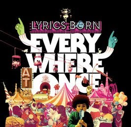
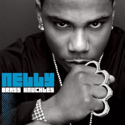
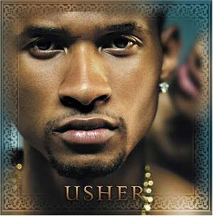 On a CD cover there is a reverse, this will contain the track list, including song length and title. Images are commonly seen, along with barcode and the producer and directors names.
For our CD cover we will be including the song title, which is stop complaining and the length of the song, 3minutes 30 we wil also be including a barcode that we have downloaded off of google images.
Here is an example of the reverse side of a CD cover:

Rough Cut Footage
This is our rough cut of our music video. On the end of the footage is some added clips that were spoken for in the previous blog. This footage hasn't been inserted into the overall footage yet as we are not sure where abouts it can all fit together into the video.
Wednesday, 21 October 2009

The editing program we are using is Final Cut Express. Above is a still image taken from Final Cut Express, it demonstrates what Final Cut looks like and the tools used (on the right hand side, corner.) Final Cut Express allows the user (us) us to edit the Timeline with the innovative Edit Overlay tool. There are many editing options including, overwrite, insert and fill to fill. To add clips, they are dragged in to the Timeline. And thanks to a highly flexible interface, you can move seamlessly through your projects, focusing your efforts on creativity and productivity. Within this still image, the gaps in the sequence can be seen along with a long shot of Rob walking down a corridor after getting kicked. This is an example of how more shot transitions will be needed (close-up's.)
need to link footage together
After uploading are footage so far it seems to show that the footage we have filmed is good but just isnt long enough to create a realistic feel for the character as he is walking around college. Also another problem was that some of are scenes are to short and need to be filmed again to allow us to link them to other clips, this then would hopefully help the flow of are music video.
To solve this problem we will need repeat a few scenes of footage just so we are able to keep the idea of a narrative theme throught are video.
Parts we may need to film again are :
1. bullies chasing the nerd scene.
2. the nurse scene.
To solve this problem we will need repeat a few scenes of footage just so we are able to keep the idea of a narrative theme throught are video.
Parts we may need to film again are :
1. bullies chasing the nerd scene.
2. the nurse scene.
Reviewing the first rough-cut
We have created our first rough cut, and established that there are some gaps.
These gaps are at 0.45 seconds, for roughly 15 seconds and comes after Rob is walking down the corridor (when he gets kicked) and before he walks down a second corridor along with the other characters. The second gap is at 1.47 to 3.30 (the end of the song). This gap comes after the footage where where Rob and the other characters are walking down the large corridor.
These gaps will need to be filled by either filming new footage or using the existing footage that currently hasn't been put into the rough cut. This footage is of the nurse (Bryony) and Rob in the medical room, this needs to be put in during a chorus as we will need to lip sync the lyrics as Bryony is mouthing words from the chorus. Another piece of footage that needs to be put in is the scene where Rob gets beaten up. Finally the part where Rob is getting chased, prior to being beaten up needs to be re-filmed as it doesn't link in with when he gets beaten up as the chase leads to a completely different location compared to where he gets beaten up. We are also thinking about filming extra footage involving more, varied shot transitions for instance, close up's of Rob. Hopefully by including these different shot transitions it will meet the marking criteria that is specified for a high level, advanced production. We will be filming this extra footage after half term and finalizing our rough cut.