 This is the CD cover, for Mika's album.
We chose this CD cover to analyse as we feel it reflects some of the techniques that we wish to incorporate in our CD cover. Mika is a solo artist that generally tends to produce music that fits into the pop genre although the genre we are supporting differentiates the key element is the fact that like Mika Lyrics Born is a male solo artist.
The Cd cover is vibrant and inviting, mainly because of the great use of colour. It holds a very 'random' theme and the images supported on the cover are extremely varied (from sofa's to a piano) however it seems to fit very well. The images are cartoonised (relating to the album title - life in cartoon motion) and out of proportion. A small image of Mika is included, which is featured in a different colour scheme but still following the cartoonised theme. The image is almost a sepia tone. (browns and grey) because these colours are different from the remainder of the bright cover it allows it to stand out and draws the audiences attention towards it.
Furthermore Mika's name is in large bold white writing that dominates most of the centre of the cover once again drawing attention to his name in order to promote his label. The name of his album (Life in Cartoon Motion) is in much smaller text and fits in with th cd cover as it almost looks like a doodle.
Moreover our music video has had a colour tint added to it in order to brighten the footage. Therefore we believe this idea could be continued to the CD cover like Mika's and be bright and colourful. Furthermore we would like to ensure the artists name (Lyrics Born) is either centred or dominates the CD cover in order to ensure the market can recognise the product they are buying.

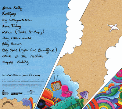
This is the back of Mika's album Cover.
The back of the cover corporates the same idea as the front cover with a little lesson detail where the tracks of the songs are. Images on the front such as the flying sofas and the coloured circles have been copied and pasted from the front. The titles of the song tracks are written in the same font as what the album title 'Life In Cartoon Motion' is. This is probably to recognise who the album belong to even if the back cover was seen before the front. The covers need to be similiar or vertually the same so they link together. The front cover can't be something completely different to the back or they will share no link and it would look a bit odd.
There is no focal point to the CD cover as this is usually seen on the front. The small song titles are in a handwritten style. The whole CD cover (back and front) is like a coloring book with random cartoon pictures almost randomly 'thrown on'.
Here is an annotation of the front of Mika's album cover...
We have just made notes on the things we believe makes the cover stand out.

No response to “Mika ''Life In Cartoon Motion'' CD cover Analysis”
Leave a reply